Tuesday 9 February 2016

It's time for pancakes!


Hooray - it's Pancake Day!
Here are the ingredients you need to make pancakes:


Place the flour into a bowl with a pinch of salt. Make a well in the centre. Then:


Melt the butter gently on the stove or in the microwave and add a spoonful to the mixture.

Heat a saucepan and add some butter or oil to grease.  Pour in some mixture and quickly spread it around the pan surface to make a round pancake shape. Once it has begun cooking it should become loose in the pan and reading for flipping:


Garnish with classic lemon and sugar or anything you like:


Wednesday 6 May 2015

Cucumber & Chilli Pepper tango

I was recently commissioned to draw a cucumber dancing with a chilli pepper. Helpfully I have drawn dancing vegetables before! The client requested various details and features that referenced the people these characters represent. Hopefully they will appreciate the sentiment though it is hard for me to know as I am not part of the private joke going on here! 
Here is the final result:


Some early sketches of various poses:


Here is an older drawing I did on a similar theme. 
The Dance of the Condiments:


Tuesday 5 May 2015

Inorikaze - Prayer Wind

My talented friend Nobuko Miyazaki is a New York based flautist, shinobue (Japanese bamboo flute) player and composer. Her latest project is an album of her own compositions recorded with a variety of professional musicians and collaborators, including the Manhattan Symphonie Orchestra, entitled - Inorikaze - Prayer Wind.

You can hear a sample of her music and find out the stories behind each composition on her website here: http://www.nobuflute.com/ 

Nobuko asked me to design a CD cover for this album. She wanted an image of a young girl playing a flute. The girl represents herself and was inspired by a photo she took of a girl she came across in Japan whilst doing voluntary aid work there following the earthquake in 2013.


The music is represented by ribbons of colour, swirling into the sky:


An early title design with brushwork type:

The final artwork:


To buy the album click here:
https://itunes.apple.com/us/album/inorikaze-prayer-wind-ep/id961365698
http://cdbaby.com/cd/nobukomiyazaki2

A portion of sales go to children's charities.

Nobuko worked tirelessly to put this album together and I am very proud to be a small part of her continuing success.

Thursday 9 April 2015

Jamie Oliver title sequence for Channel 4

Recently screened on Channel 4 was the 2nd series of the food programme 'Jamie and Jimmy', featuring well known chef Jamie Oliver. I was asked to contribute to the title sequence by designing name plaques that pop up revealing the celebrities taking part in the cookery show. The theme I was given was British fairground so I looked at lots of lovely, old, hand-painted signs.  I couldn't use actual fonts because of copyright so I created my own as well as hand drawn elements:


Here's a still to show how they featured in the final animation:


It is a very minor element of a lovely animated title sequence created at Picasso Pictures, directed by Jens and Anna which you can view here.


Tuesday 16 December 2014

Matte painting

Recently I have been working as a matte painter/background artist for an animated commercial campaign made at Picasso Pictures for the directing duo Jens and Anna. The campaign included various 30sec commercials as well as online web films with information about new healthcare initiatives in Kentucky, USA. I began working on the campaign last summer (2013) when I was asked to create high resolution images from details in the commercial that could be used for the accompanying print campaign. This year I was asked to do backgrounds that were used in the actual commercial. My images were then projected onto the 3D elements of the scenes with 2D character animation added from Flash.

I was given wireframes of the scenes from the CG animators which I then painted in Photoshop according to the project style. Below you can see an example of a wireframe and then the finished background:


The images are created at a size that allows for camera moves within the shots. For example, the image below is wider than the TV ratio because the camera move goes from left to right within the image. I also had to draw more information on layers so there was enough imagery as the camera moves around revealing different parts of the picture.


I was also given matte references for the 3D objects to help isolate areas for colouring:


Additional shadow layers were added by the CG programme (Maya) into footage that was then composited together and colour graded for the final output. Here is the finished commercial:


Here is a time lapse video of a background I made for the most recent commercial:


Thursday 6 November 2014

The Science of Splats

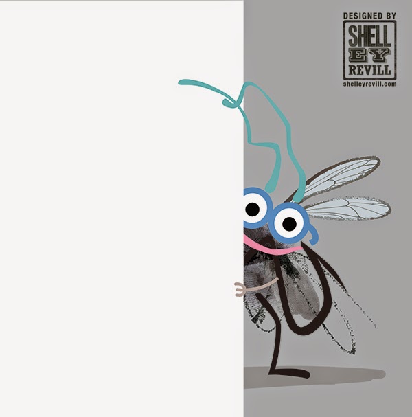
I have been working on an illustrated character for a long time, trying to envisage his macro world (he is very small). His name is Marvin and here is a glimpse of him:


I wanted some paint splat textures to use as background elements. This coincided with an episode of creative funk. It turns out that what I needed to do to regain my illustration mojo was to throw some paint around:


These splats were made flicking paint from a paintbrush about 1 inch wide. They are useful but despite me scanning them at 1200dpi I still wasn't getting a big enough splat for my requirements.

I then tried pouring some paint from a height:


This is better though the paint has a bit too much water in it. Good splat spread (also on my shoes, and the road, but at least I went outside right?).

I love working digitally but also adding real textures and ink lines to my work. It always give the resulting images more freshness, character and life. Marvin is made up of crisp vector lines, ink lines, finger prints and smudges.

It was all great fun and brought up memories of my art school floor which was multi-coloured with paint splats. The only trouble is it makes me want to get big pots of paint, a step ladder and a large bare floor with white walls and just go for it!

Wednesday 29 October 2014

The love story of Betty and Barry Bourbon

I created these biscuit characters whilst developing a series of greetings card ideas. I liked the confetti 'Just Married' bourbon biscuits and decided to discover how they met. So here is the love story of Betty and Barry Bourbon:


See more comic sketches on my website here